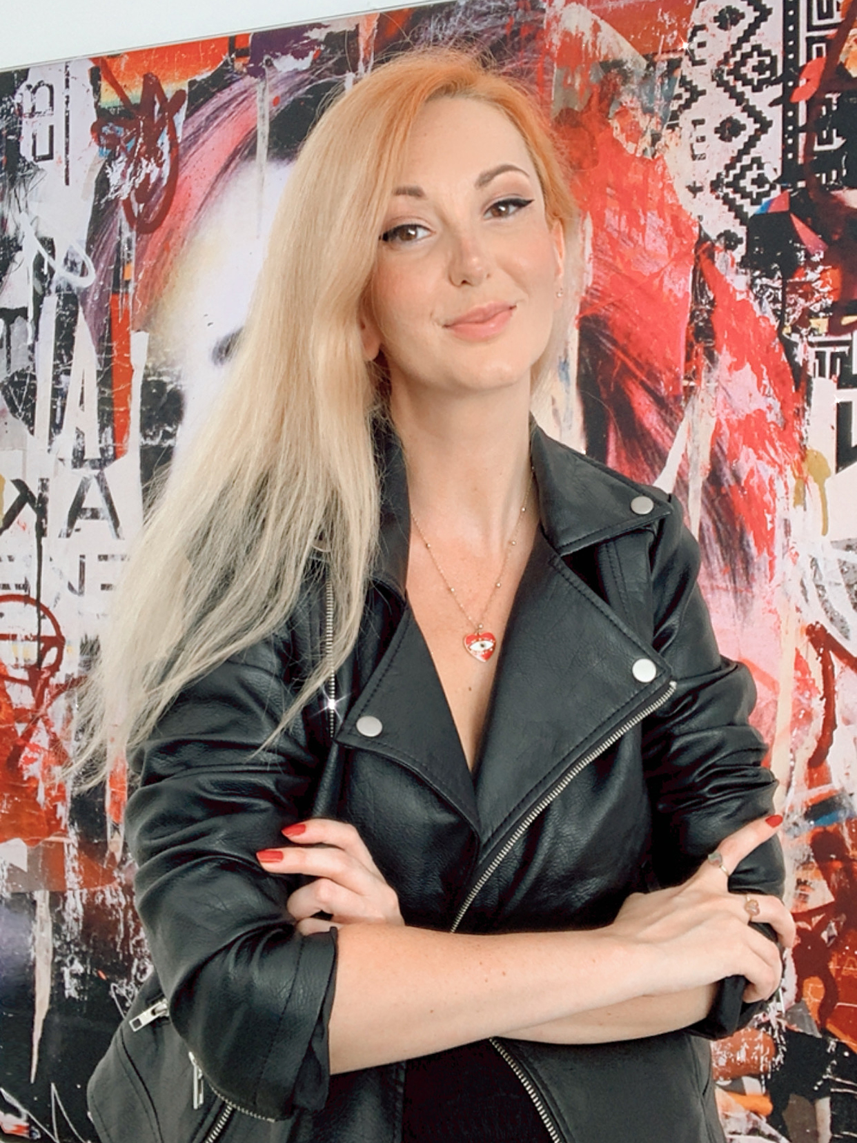
For those of you who are new here, welcome to a brief journey through my design and branding experience.
Even though a lot of my portfolio showcases projects related to the music industry – music being one of my biggest passions – my professional experience extends beyond that. The following are a few examples of work I have done that highlight my branding and design skills the best.
While my skills are versatile and vary from project to project, I always maintain a hands-on approach to every task, as the creative process is my favorite part.
Reaching goals and seeing tangible results is my top priority, but the steps I take to discover the best solution, as well as seeing how ideas take shape before my eyes, are by far the most exciting aspects of my work.

My first advertising agency experience started in 2005 when I was hired at Magenta Advertising in Bucharest, Romania. Even though prior to this I only had experience designing for the music industry and small local events, the owner and creative director of Magenta Advertising gave me the chance to grow my skills by hiring me as a web and graphic designer.
My assignments were to create logos, presentation websites, catalogues, web applications (like CRM’s) and other banners and graphics used in visual communications.
Together with the rest of the team, the websites were turned functional through the use of web technologies like HTML, CSS, Php and other programming languages.

(photo courtesy of UnSplash)
The majority of the companies we worked with were from the construction, agriculture, and manufacturing industries. Even though these companies were small sized, having the chance to create for these industries has given me the insight into how to present and communicate different types of technical information in a way that speaks precisely for the people involved into these fields.
For example, before starting to work on a project, I noticed a lot of these businesses only had technical sheets and documents related to the specs of their products. Even though the information provided was minimal, at the end of the project, all the businesses had fully functional brands with
- a clear visual style,
- a distinctive logo used on a variety of situations (from being used on printed documents, to being used on industrial machinery, or work equipment),
- also an eye catching and intuitive website which presented not only their capabilities but also the way the industrial process worked.
It was a great way for me to understand branding principles that are universal to any kind of project – like:
- the personality of a brand
- its position on the market
- the story of the company
- what differentiates them from the rest
- and the impact said brand has.
I also learned how the use of colors and contrast, organizing the information in a way that guides audiences through the story and the discovery of a brand, and coherency, play a vital role in the development of a successful branding journey.
It familiarized me with the use of grids, layouts, space, content hierarchy, content strategy, and typography in my design work – all concepts which are today recognized under the name of user experience.
When I worked for The AdGency in Bucharest it was another wonderful opportunity for me to use my visual design, branding, and ux skills on projects from a diverse set of industries. My experience there allowed me to have a glimpse into creating concepts and assets for media outlets – like television, radio or print magazines.
Net Source was the Bucharest branch of a multinational company focused on entertainment and gaming industry, with offices in USA, Panama, Romania, and Dubai.
Besides my tasks to create website layouts, graphic assets, digital advertising campaigns and 2D objects for the games and entertainment portals developed by Net Source, I also had the fun and creative challenge to create sound designs for video games – like chimes, notifications, special effects.
Later on, being hired at RoBrady in Sarasota Florida helped me understand what role branding plays in the bigger picture of companies big and small. Because RoBrady was primarily an industrial design studio, I had the opportunity to collaborate with product design teams and create visual communications for a variety of medical devices, maritime products, transportation objects, environmental and weather related gadgets, or eco-conscious inventions.
One of the projects that brought a lot of joy to be part of is creating the graphic interface and user experience for the Cleanyst device, which was a home-use detergent making machine. Because in the industrial process of production of detergents there are a lot of factors that impact the environment in a negative way, Cleanyst invented a machine that reduces the water waste and the chemical waste by allowing individuals to create their own detergents in a safe way right from the comfort of their home.
By being present in the process of the creation of this machine from sketches to prototype to functional prototype, I have learned how to tie the physical product, the company story, their mission statement and their promise into a coherent visual style across a multitude of platforms – from icons to digital app interface, to website and product manual.

Another exciting project was the conceptualization of the graphical interface for – what was at the time – Harley Davidson’s first electrical motorcycle. It allowed me to take a bigger visual language and brand style guide and adapt it to a new product that was to maintain its original voice, but adapt to different requirements of a completely new technology.
I used a simplified visual language in terms of graphic elements, but maintained coherence with the bigger brand by using the same brand color, the same “edgy” style, and the same shapes and forms that Harley Davidson already was using in their communication.
The result was a variety of concepts, but overall it challenged me to extrapolate a brand to a new application while still maintaining its traditional voice.
The same wonderful creative challenge was given to me by Stella Artois when I was contacted to create a campaign for them for social and digital media.
The scope of the project was to expand their brand awareness in Florida. The idea was to create a campaign that promotes family traditions and the creations of new ones, centered around personal values.
I respected the core global brand values and messaging of Stella Artois, while bringing my own creative spin to this assignment.
The concept I came up with was highlighting the continuation of a family tradition that I carried with me, even years after moving from Europe to United States. I reached that goal by creating images, videos and creative texts for social media and my blog.
Other notable mentions of projects where I used my branding and design knowledge are:
- Yamaha boat interfaces – more details at this link
- Livenation Beer Vending Machine – more details at this link
- Burberry Fresh Glow – an advertising campaign where I created videos and images centered around newly launched makeup line by Burberry
- Yamaha Music Stay True headphones and earbuds advertising campaign
- ASUS Vivobook 2in1 tablet and laptop artist edition ad campaign (social media campaign)


